00
Contemporary Branding

HEARTCORE ST. PAULI

No Heroes. All Heart.
00
Challenge
FC St. Pauli has always stood for more than football. For many years, the club brought much of its social commitment together under the name Kiezhelden (Neighbourhood Heroes) – from supporting local communities to championing democracy, diversity and social inclusion.

But the initiative had long outgrown its name. Many of its projects now reached far beyond the neighbourhood, making an impact across Hamburg and throughout Germany. And the idea of “heroes” no longer reflected a club that sees social commitment not as the extraordinary achievement of a few, but as the shared responsibility of many.

Time for a brand with a vision as far-reaching as the commitment behind it.
00
Idea

Standing up for what matters is everyone's game.

St. Pauli doesn't need heroes.

Because what makes this club special isn't built on pedestals. It's built on community. Solidarity, conviction and tangible support. People who take a stand. Fans, members, partners and organisations coming together to make a difference.

So our strategic idea shifts the focus: away from individual heroes and towards what unites everyone.

A heart for the community.

The new identity needed to make that heart visible – while capturing the uncompromising spirit with which St. Pauli stands by its values.

Heart meets Core.
00
Result

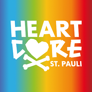
Kiezhelden becomes HEARTCORE ST. PAULI.

A name that unites two defining sides of the club.

HEART stands for solidarity, empathy and community.
CORE stands for conviction, commitment and St. Pauli's fighting spirit.

The Kiez is no longer a geographical boundary. ST. PAULI becomes the unmistakable signature.

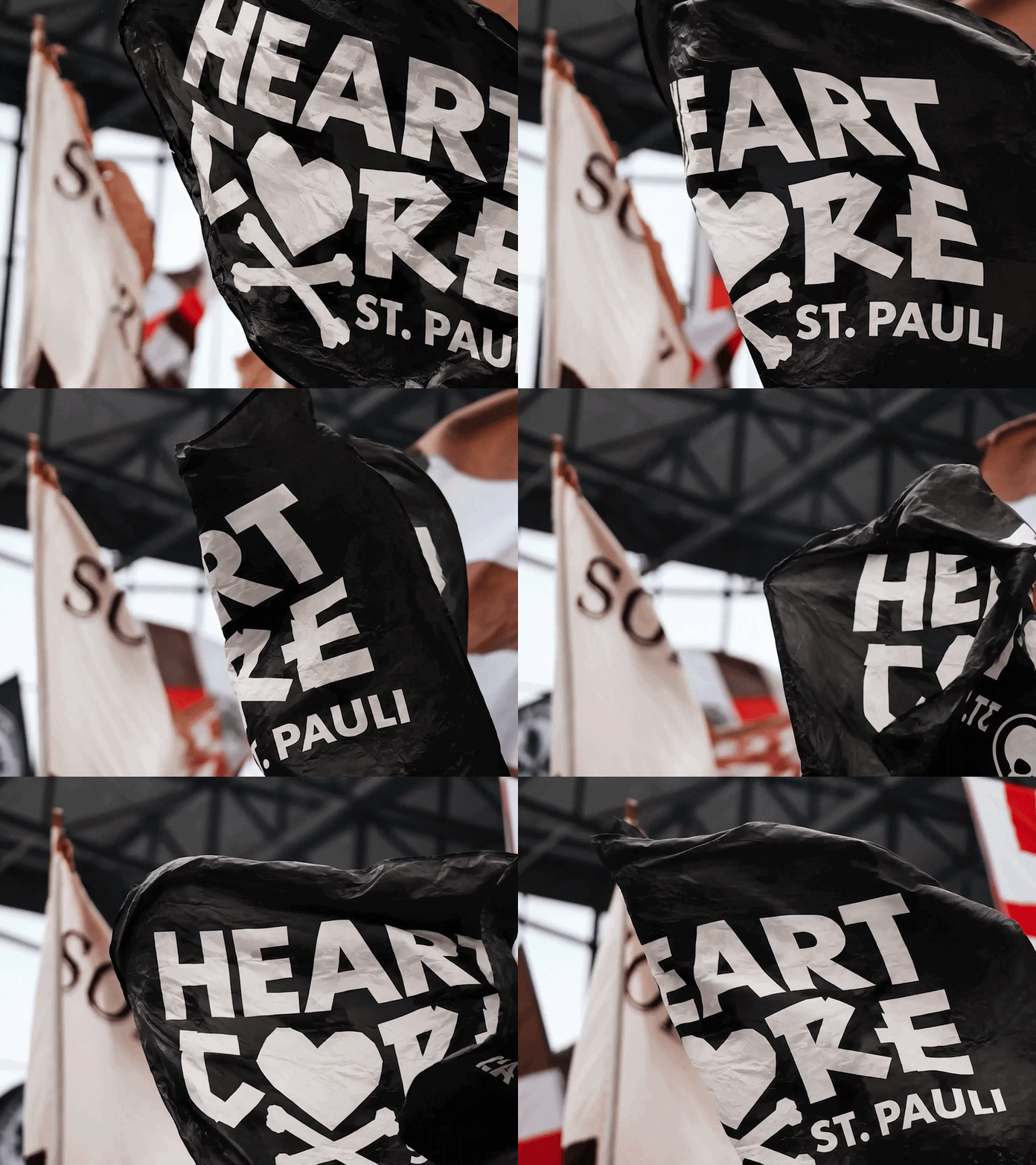
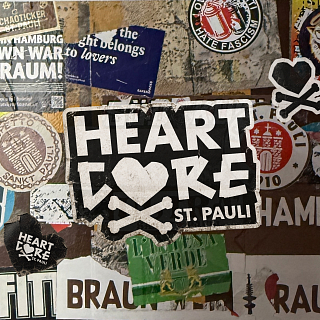
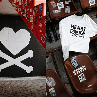
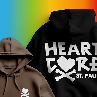
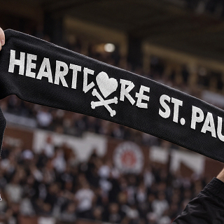
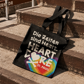
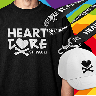
And one of football's most iconic symbols is reimagined: the Heart Jolly. The crossed bones remain. The skull makes way for a heart.

Rebellion meets solidarity.

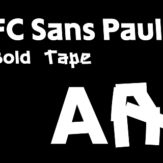
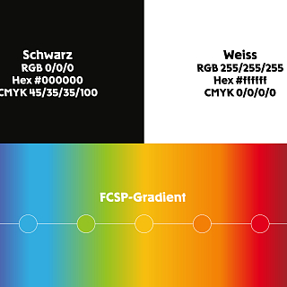
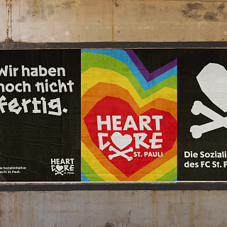
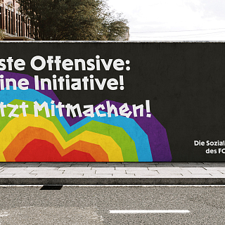
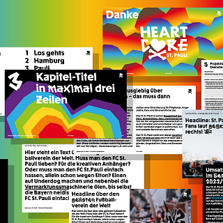
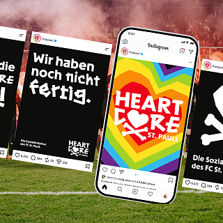
Around this symbol, we created a distinctive design language rooted in FC St. Pauli's visual universe: black and white as the foundation, the FCSP gradient, an evolving heart pattern and FC Sans Pauli, the typeface developed by Karl Anders. Its rough, tape-cut edges give HEARTCORE the raw, activist attitude the brand calls for.

The result is anything but a typical charity identity.

It's St. Pauli.

Wearing its heart on its crossbones.

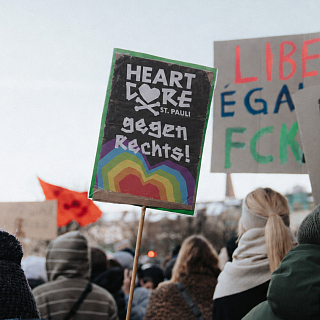
HEARTCORE ST. PAULI now brings the club's social initiatives together under one clear identity, creates greater transparency around funding and programmes, and invites more people to become part of the movement.

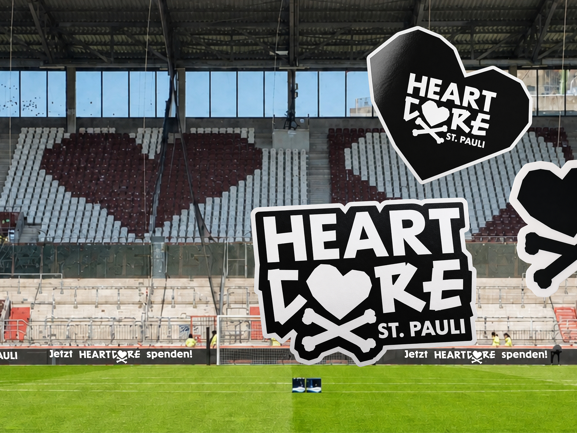
For the launch, the new identity makes its mark on the Millerntor Stadium itself: the Altona-based Female Crew brings HEARTCORE to the South Stand with a large-scale mural.