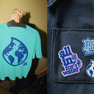
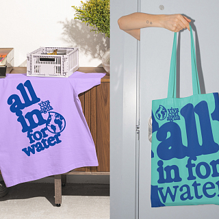
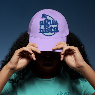
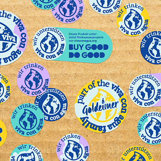
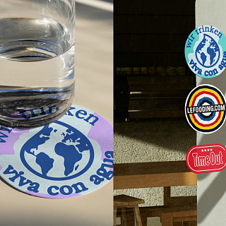
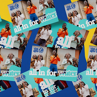
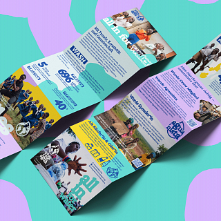
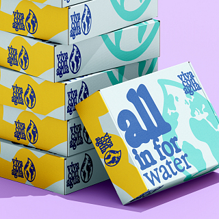
Viva con Agua has stood for positive activism, lived community, and the conviction that social change can be joyful for 20 years. Together, we evolved the brand strategically and visually – internationally accessible, full of energy, and unmistakably Viva con Agua.
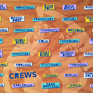
What began in 2006 as a Hamburg initiative is now an international community of non-profit work, social business, art, music, and sport. Viva con Agua connects people, organizations, and ideas across countries and cultural boundaries – with one shared goal: water for all.
As the movement has grown, so has the brand. More and more actors use it, interpret it, and carry it into new contexts. That is precisely its strength. And its challenge.
Because a brand like Viva con Agua must not suffocate under a rulebook. It needs orientation without losing its openness. Recognizability without becoming uniform. A system that holds things together without holding them back.
Our task was to translate the grown diversity of the Viva con Agua cosmos into a clear, internationally applicable brand identity – while preserving what makes the organization a true love brand: spontaneity, creativity, humanity, and positive activism.
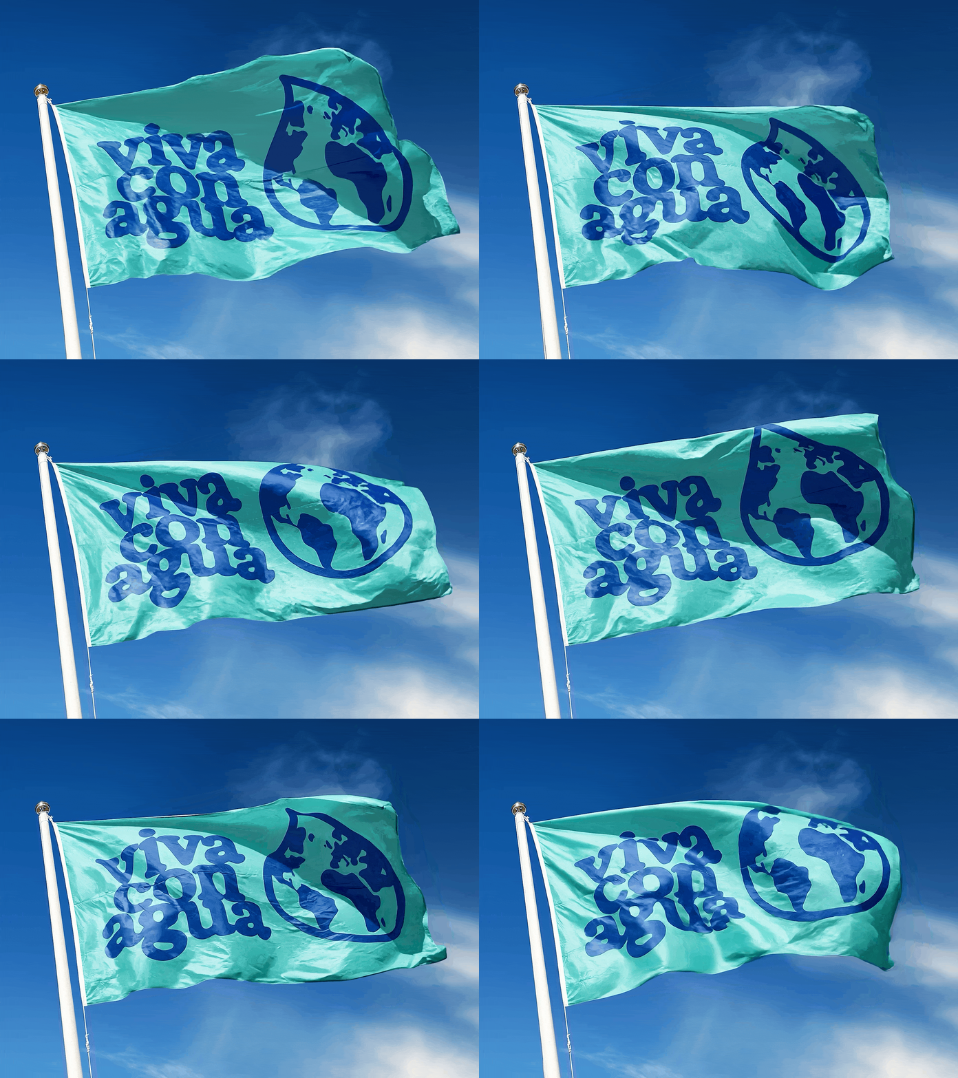
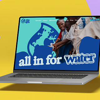
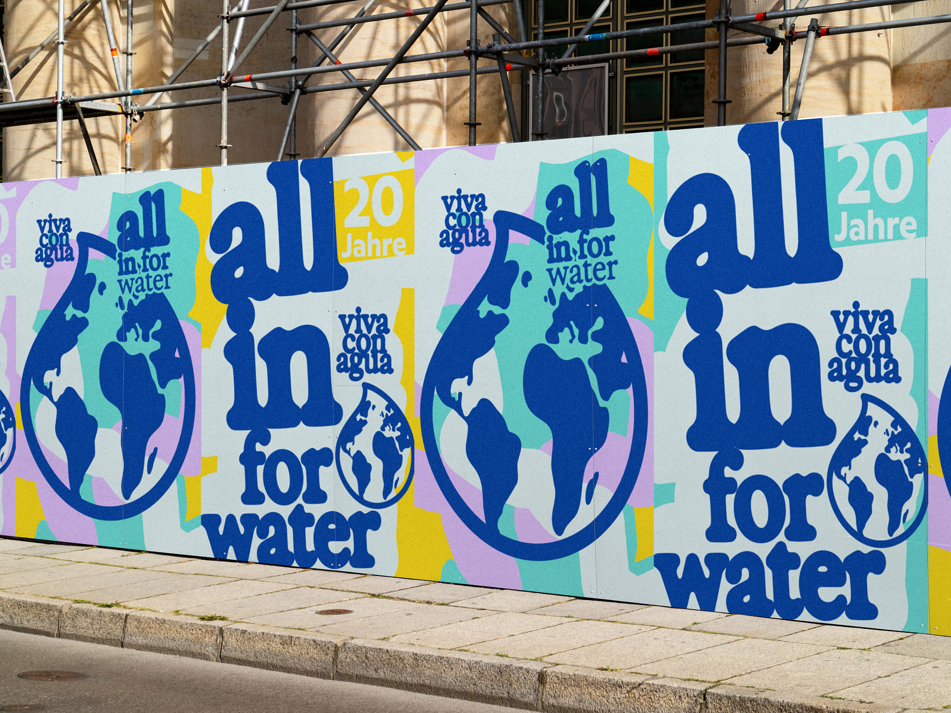
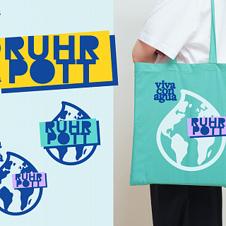
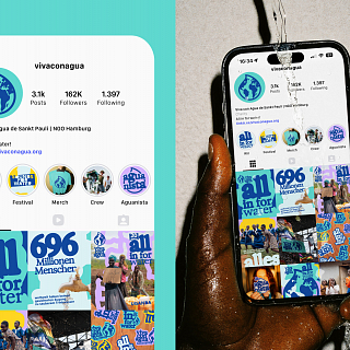
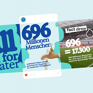
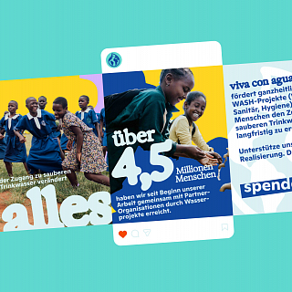
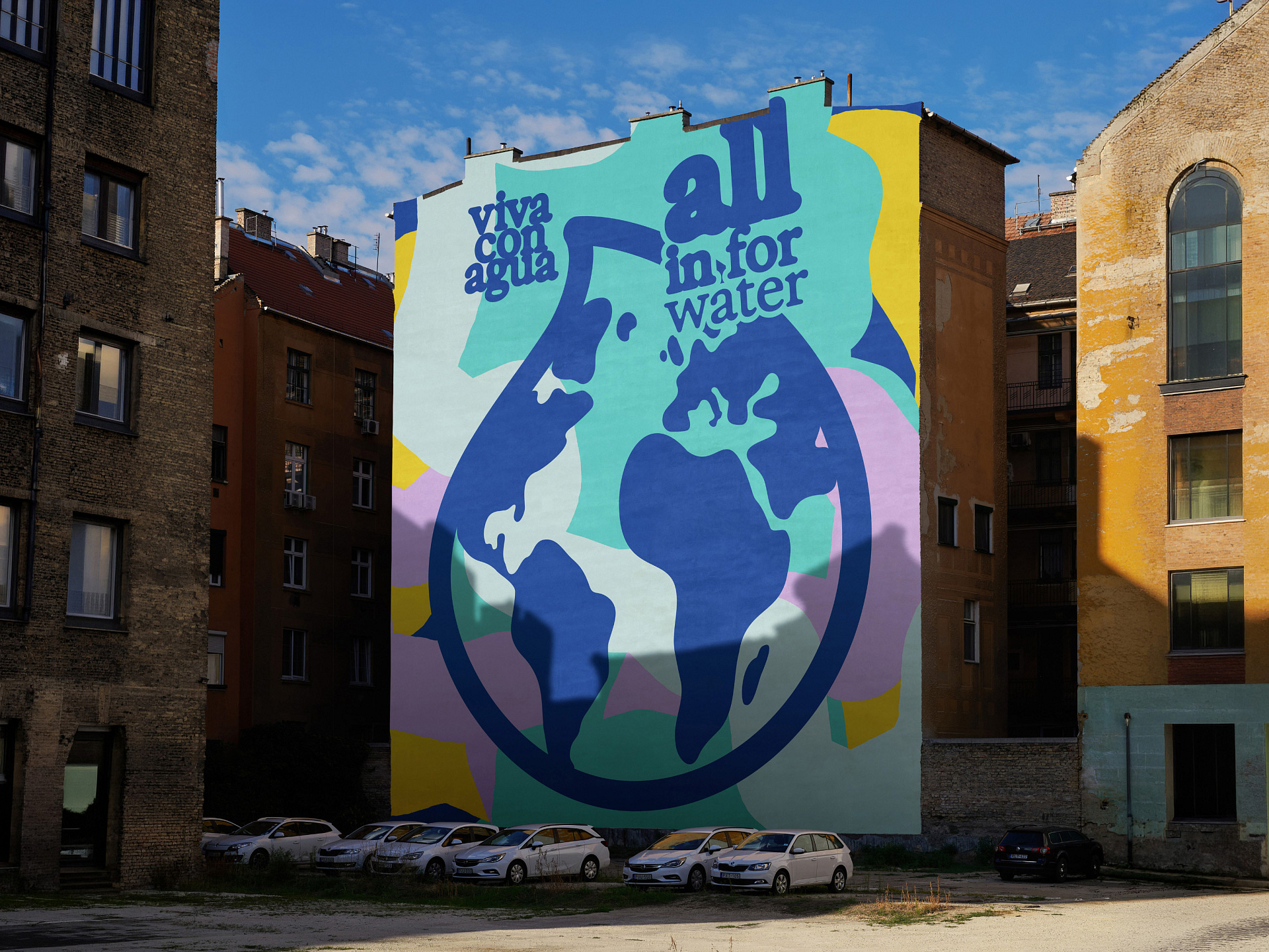
Instead of a classic corporate design, we developed a flexible brand system together with the Viva con Agua team. One that works on digital platforms just as well as at festivals, at sports and cultural events, on merchandise, or in the middle of public space.
A reliable framework in which as much as possible can happen.
Water needs an incline
The central design idea follows a simple observation: water doesn't flow on its own. It needs an incline.
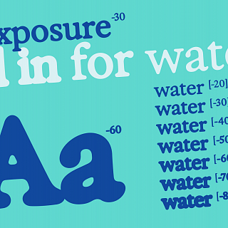
Four degrees therefore become the defining principle of the new visual identity. Typography, surfaces, and graphic elements are set in motion. Shapes and letterforms flow into one another, touch, and connect into a living whole.
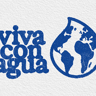
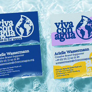
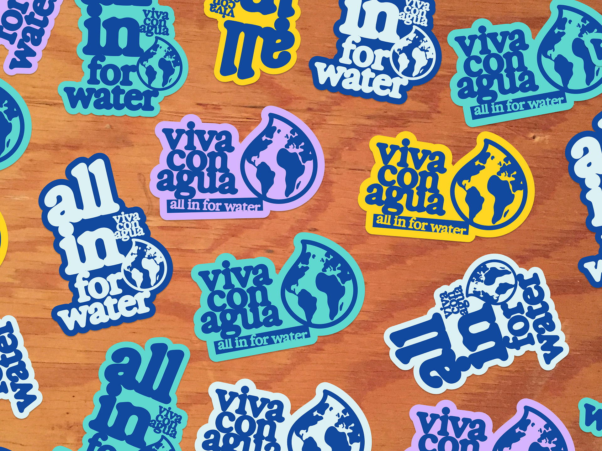
The evolved logo retains its familiar, handmade character while gaining clarity and flexibility. The world inside the drop now appears in the Gall-Peters projection – a shift in perspective toward a more equitable representation of the continents.
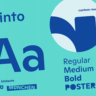
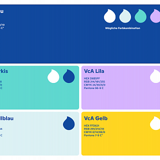
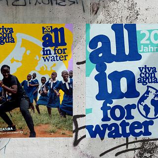
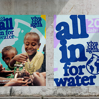
A powerful color world and a distinctive typographic system create recognizability without over-regulating the brand. The identity can adapt to its context – and still always remains Viva con Agua.
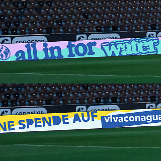
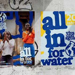
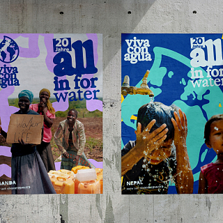
The connective thread is the claim developed by Viva con Agua: "All in for Water". It is more than a new closing line. It is attitude, commitment, and an open invitation to everyone who has something to contribute.
The result is not a finished picture of an organization. But a powerful tool for a growing movement.
For more connection. More participation. More movement.
All in for Water.